White Space
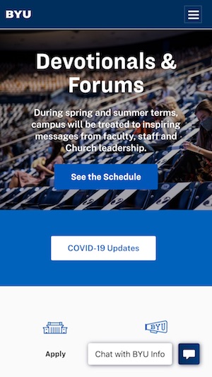
Brigham Young University
The mobile app from BYUs home page uses white space. As you scroll down the items gives good spacing. The spacing looks pleasing to the eye and does not look too clumped or too spaced out.
Visual Hierarchy
Rocket League
Theres is a food amount of visual hierarchy on this website. Just from the image below we see that the main focus in on "Season 3". Then "Rocket League" is to the top left in a smaller font. The hierarchy tells the reader what to read first.

Alignment
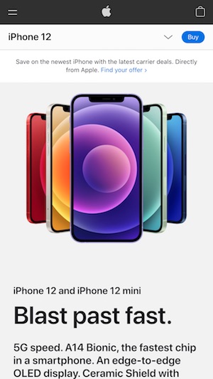
Apple
There is good left alignment here with the text. This makes it look clean and is pleasing to the eye. Througout the page the alignment is set so that it is easy to read.